Enkindl How-To Guide
Getting Started
Enkindl is an AI-powered web development platform that helps you build, edit, and deploy web applications using natural language and visual tools. Whether you're prototyping a landing page, building a full-stack dashboard, or iterating on an existing project, Enkindl streamlines every step of the workflow so you can ship faster.
Unlike traditional development tools that require you to write every line of code manually, Enkindl combines the power of artificial intelligence with professional-grade editors. You can describe what you want in plain English, and the AI generates production-ready code. Then use the visual editor for design tweaks, the code editor for precise control, and the AI chat for ongoing modifications—all in one seamless workspace.
Sign Up & Login
Head to the homepage and click Sign up or Login. You have two authentication options:
- Email & Password: Create an account with your email address. You'll receive a verification email to confirm your account. Choose a strong password with at least 8 characters, including uppercase, lowercase, and numbers.
- Google OAuth: Click "Continue with Google" for instant access using your existing Google account. This is the fastest way to get started—no password to remember, and you're logged in with one click.
After logging in, you land on the Projects page where all your work lives. This is your dashboard—think of it as your project portfolio. You'll see all your existing projects displayed as cards, each showing a thumbnail preview, project name, and last modified date. From here, you can create new projects, open existing ones, or delete projects you no longer need.
System Requirements
Enkindl runs entirely in the browser—no downloads, no installations, no local setup required. This means you can work from any computer with internet access. For the best experience:
- Browser: Use the latest version of Chrome (recommended), Firefox, Safari, or Edge. Chrome provides the smoothest experience with the Monaco editor and live preview features.
- Internet Connection: A stable broadband connection is required. The platform streams AI responses in real-time and syncs your changes to the cloud continuously. Minimum 5 Mbps recommended.
- Screen Resolution: At least 1280×720 pixels is recommended. The editor uses a split-pane layout with code on the left, preview on the right, and AI chat in a side panel. Larger screens (1920×1080 or higher) provide the most comfortable workspace.
- Hardware: Any modern computer from the last 5 years will work. 4GB RAM minimum, 8GB+ recommended for working with larger projects.
Navigation Overview
The platform is organized into four main areas, each designed for a specific part of your workflow:
- Projects Page — Your central hub for project management. View all your projects in a grid layout with thumbnail previews. Each project card shows its name, last-modified date, and a quick preview screenshot. Click any card to open that project in the editor. Use the "New Project" button to start fresh, or the search bar to find specific projects when you have many. You can also filter projects by date or sort them alphabetically.
- Editor — The heart of Enkindl where you spend most of your time. It combines multiple tools in one unified interface: a Monaco-powered code editor (the same engine that powers VS Code) for writing code, a GrapesJS visual editor for drag-and-drop design, a live preview pane that updates in real-time as you make changes, and an AI chat assistant that understands your project context. Everything is synchronized—changes in the code editor appear in the visual editor and preview instantly.
- Profile — Manage your account settings and preferences. Update your display name, email address, and profile avatar. View your account creation date and current subscription tier. Check usage statistics including total projects created, AI requests made this month, and storage used. You can also change your password, enable two-factor authentication, and manage notification preferences.
- Usage & Billing — Monitor your credit balance and AI usage. See a detailed breakdown of credits consumed by project generation, AI chat requests, and image generation. Review your usage history with charts showing daily/weekly/monthly trends. Upgrade to higher-tier plans for more credits, faster generation, and priority support. Purchase additional credit packs if you need more capacity before your next billing cycle.
Tip: Bookmark the Projects page (Ctrl+D / Cmd+D) so you can jump straight into your work without navigating through the homepage. You can also pin the editor tab in your browser for quick access while researching documentation or browsing design inspiration. Many users keep Enkindl open in one browser window and reference materials in another for maximum productivity.
Your First 5 Minutes
New to Enkindl? Here's a quick walkthrough to get you building in under 5 minutes:
- Sign up using Google OAuth for instant access (30 seconds)
- Click "New Project" on the Projects page (5 seconds)
- Describe your project in the prompt box: "Create a personal portfolio website with a hero section, about me, projects gallery, and contact form. Use a modern dark theme." (1 minute)
- Click "Build" and watch the AI generate your project in real-time (1-2 minutes)
- Review the live preview and use the AI chat to make adjustments: "Change the hero background to a gradient" or "Add social media icons to the footer" (1-2 minutes)
That's it! You now have a fully functional website you can customize, deploy, and share. No coding required for the initial build, but full code access when you want fine-grained control.
AI Project Generation
The AI project generator is Enkindl's most powerful feature—it lets you describe what you want to build in plain English and receive a fully-structured, production-ready project in seconds. No more wiring boilerplate by hand, configuring build tools, or setting up folder structures. Just explain your intent and let the AI scaffold your HTML, CSS, JavaScript, TypeScript, and all configuration files.
This isn't just code generation—it's intelligent project creation. The AI understands modern web development best practices, creates proper component hierarchies, sets up routing, configures TypeScript with correct settings, installs necessary dependencies, and even generates placeholder content that makes sense for your project. You get a complete, working application that you can immediately preview, customize, and deploy.
What Makes It Different
Unlike simple code generators that output snippets, Enkindl's AI creates entire applications with:
- Complete Project Structure: Proper folder organization (src/, components/, pages/, assets/), configuration files (package.json, tsconfig.json, vite.config.ts), and build setup.
- Modern Tech Stack: React 18 with TypeScript, Vite for blazing-fast builds, CSS modules or Tailwind for styling, and proper ESLint/Prettier configuration.
- Responsive Design: All generated layouts work perfectly on desktop, tablet, and mobile out of the box. No need to add media queries later.
- Semantic HTML: Proper use of header, nav, main, section, article, and footer tags for accessibility and SEO.
- Type Safety: TypeScript interfaces for all data structures, ensuring type safety throughout your application.
- Working Features: Forms actually submit, buttons trigger actions, navigation works, and interactive elements respond to user input.
How It Works
Open the Prompt Box
On the Projects page you'll find a large text input at the top. This is the Prompt Box. Click inside to start typing your project description.
Describe Your Project
Write a clear, detailed description of what you want. Include the type of site (landing page, dashboard, portfolio), design preferences (dark theme, minimal, vibrant), key sections (hero, features, pricing, contact form), and any specific functionality (local storage, API integration).
Click Build
Hit the Build button. You'll be redirected to the Editor where you can watch the AI work in real-time. A Build Activity panel on the left shows live logs, status updates, and a progress percentage.
Review & Customize
Once generation completes, the live preview appears on the right. The file explorer shows every generated file. Open any file in the code editor to tweak styles, swap copy, or add new functionality.
Use AI Chat for Further Changes
After your project is generated, the AI Chat Assistant in the left panel becomes your primary tool for making changes. Instead of manually editing code, simply describe what you want: "Change the hero background to a gradient," "Add a testimonials section," or "Make the navbar sticky." The AI understands your project context and makes changes directly to your files. This is often faster than coding by hand—especially for styling, adding components, or fixing issues.
Pro Tip: Think of the AI Chat as your first tool for any change, not just initial generation. Need to add a feature? Ask the chat. Found a bug? Describe it to the AI. Want to refactor? The AI can do it. Only dive into manual code editing for fine-grained control or when you want to learn how something works.
Prompt Writing Tips
The quality of your output depends heavily on the quality of your input. Vague prompts produce generic results; specific prompts produce tailored projects. Think of the prompt as a conversation with a developer who needs clear requirements. The more detail you provide, the closer the result matches your vision.
Structure Your Prompt
A well-structured prompt includes these elements:
- Project Type: Start with what you're building: "Create a landing page," "Build a dashboard," "Make a portfolio website," "Design an e-commerce product page."
- Key Features: List the main sections or functionality: hero section, navigation, forms, galleries, pricing tables, testimonials, etc.
- Design Style: Describe the visual aesthetic: modern, minimalist, bold, playful, corporate, elegant, vibrant, professional.
- Color Scheme: Specify colors if you have preferences: "dark theme with blue accents," "light background with green primary color," or exact hex codes.
- Interactions: Mention any specific behaviors: smooth scrolling, animations, hover effects, form validation, modal dialogs.
- Content Hints: Provide context about the content: company name, taglines, number of items to display, placeholder text preferences.
Be Explicit About Features
Instead of vague descriptions, be specific:
| Vague | Specific |
|---|---|
| "A nice website" | "A single-page portfolio with sticky navbar, hero section with my name and tagline, grid of 6 project cards, and contact form" |
| "Add a form" | "Add a contact form with name, email, phone, and message fields, plus a submit button that validates email format" |
| "Make it look good" | "Use a modern design with card-based layout, subtle shadows, rounded corners, and smooth transitions on hover" |
| "Some colors" | "Dark background (#1a1a1a) with teal accent color (#14b8a6) for buttons and links" |
Design Style Keywords
Use these keywords to guide the AI's visual decisions:
- Modern: Clean lines, ample whitespace, contemporary fonts, subtle animations
- Minimalist: Maximum simplicity, limited color palette, lots of negative space
- Bold: Strong colors, large typography, high contrast, eye-catching elements
- Playful: Bright colors, rounded shapes, fun illustrations, casual tone
- Corporate: Professional, conservative colors (blues, grays), formal typography
- Elegant: Sophisticated, refined, subtle gradients, serif fonts
- Vibrant: Energetic colors, dynamic layouts, bold imagery
- Brutalist: Raw, unpolished, stark contrasts, unconventional layouts
Specify Pages and Sections
If you need multiple pages or specific sections, list them clearly:
Create a business website with these pages:
1. Home - Hero, services overview, testimonials, CTA
2. About - Company story, team members, values
3. Services - Detailed service descriptions with pricing
4. Portfolio - Project gallery with filters
5. Contact - Form, map, office locations
Describe Interactions and Behavior
Tell the AI how things should work:
- "Smooth scroll to sections when clicking nav links"
- "Fade-in animations as elements enter viewport"
- "Hamburger menu for mobile navigation"
- "Image carousel with auto-play and manual controls"
- "Form validation with inline error messages"
- "Modal popup for newsletter signup"
- "Sticky header that shrinks on scroll"
Example Prompts (Copy & Customize)
Portfolio Website
Create a modern portfolio website with:
- Hero section with my name "Jane Doe" and subtitle "Full-Stack Developer"
- About section with a short bio and a profile photo placeholder
- Projects section showing 6 cards in a responsive grid, each with image, title, description, and tech stack tags
- Skills section with progress bars for different technologies
- Contact form with name, email, and message fields with validation
- Footer with social links (GitHub, LinkedIn, Twitter)
Use a dark theme (#0a0a0a background) with purple accents (#8b5cf6).
Add smooth scroll navigation and fade-in animations.
SaaS Landing Page
Build a SaaS landing page for a project management tool called "Taskly":
- Sticky navbar with logo, features, pricing, and "Start Free Trial" CTA button
- Hero with headline "Manage Projects Effortlessly", subheadline, email signup, and product mockup image
- Features section with 4 feature cards (icons, titles, descriptions): Task Management, Team Collaboration, Time Tracking, Reporting
- Pricing table with 3 tiers (Free, Pro $29/mo, Enterprise $99/mo) showing features comparison
- Testimonial carousel with 3 customer quotes including photos and company names
- FAQ accordion with 5 common questions
- Footer with links (Product, Company, Resources, Legal) and newsletter signup
Light theme, blue primary color (#2563eb), modern and professional design.
E-commerce Product Page
Create an e-commerce product page for wireless headphones:
- Product image gallery with 4 images and thumbnail navigation
- Product details: name, price ($199), rating (4.5 stars), availability
- Color selector (Black, White, Blue) with visual swatches
- Quantity selector and "Add to Cart" button
- Product description with key features in bullet points
- Specifications table (Battery Life, Bluetooth Version, Weight, etc.)
- Customer reviews section showing 3 reviews with ratings
- Related products carousel at the bottom
Clean, modern design with green accent color for buttons.
Restaurant Website
Build a restaurant website for "Bella Italia":
- Full-screen hero with restaurant photo and "Reserve a Table" button
- About section with restaurant story and chef photo
- Menu section organized by categories (Appetizers, Pasta, Pizza, Desserts) with prices
- Gallery with 8 food photos in a masonry grid
- Reservation form with date, time, party size, and special requests
- Location section with embedded map placeholder and address
- Footer with hours, contact info, and social media
Warm, inviting design with red and gold accents, elegant typography.
Blog/Magazine Layout
Create a tech blog homepage:
- Header with logo, navigation (Home, Articles, Categories, About), and search bar
- Featured article section with large image, headline, excerpt, and author info
- Grid of 9 recent articles with thumbnail, title, excerpt, date, and category tag
- Sidebar with popular posts, categories list, and newsletter signup
- Pagination at the bottom
- Footer with about text, recent posts, and social links
Modern magazine-style layout, clean typography, blue and gray color scheme.
Dashboard Application
Build an analytics dashboard:
- Sidebar navigation with logo, menu items (Dashboard, Analytics, Reports, Settings), and user profile
- Top bar with search, notifications icon, and user dropdown
- Main content area with:
  - 4 stat cards showing key metrics (Users, Revenue, Conversions, Growth)
  - Line chart showing data over time
  - Table with recent transactions (date, customer, amount, status)
  - Pie chart showing traffic sources
- Dark theme with blue accents, modern card-based layout
Make it responsive with collapsible sidebar on mobile.
Understanding Build Logs
During generation, the Build Activity panel displays real-time logs. Understanding these logs helps you diagnose issues and know when to wait vs. when to act:
| Log Message | Meaning |
|---|---|
Starting generation... | Build initiated; AI is reading your prompt. |
Planning • files: X | AI is deciding which files to create. |
Generating • files: X | AI is writing code for each file. |
Installing dependencies... | npm packages are being installed. |
Starting server... | Dev server spinning up for preview. |
Completed with URL: ... | Build finished successfully. |
Generation Time & What to Expect
Project generation typically takes 1-3 minutes depending on complexity. Here's what happens during that time:
- 0-30 seconds: AI analyzes your prompt and plans the project structure
- 30-90 seconds: Files are generated (components, pages, styles, configs)
- 90-120 seconds: Dependencies are installed (npm packages)
- 120-180 seconds: Project builds and dev server starts
You can watch the progress in real-time through the Build Activity panel. Don't close the browser tab during generation—it will interrupt the process.
After Generation: Next Steps
Once your project is generated, you have several options:
- Preview Immediately: The live preview loads automatically. Click around to test functionality, check responsive design by resizing the preview, and verify all sections are present.
- Use AI Chat for Changes: Instead of diving into code, describe changes to the AI: "Make the hero text larger," "Change button colors to green," "Add a pricing section." This is often faster than manual editing.
- Explore the Code: Open the file explorer to see the generated structure. Click any file to view its code in the Monaco editor. This is great for learning how the AI structured the project.
- Customize Visually: Switch to Visual Editor mode to drag-and-drop elements, adjust spacing, change colors, and fine-tune the design without touching code.
- Deploy: Connect to GitHub and push your project, then deploy to Vercel, Netlify, or any hosting platform. Your project is production-ready from the start.
Iterating on Generated Projects
The initial generation is just the starting point. Most users iterate through several rounds of AI-assisted changes to perfect their project:
- Review the Output: Check if all requested features are present and working correctly.
- Request Refinements: Use AI Chat to adjust styling, add missing features, or fix issues: "The navbar needs more padding," "Add a testimonials section," "Make the form fields larger."
- Add Custom Content: Replace placeholder text and images with your actual content. You can do this manually in the code editor or ask the AI to help.
- Test Thoroughly: Click every button, submit forms, test navigation, and check mobile responsiveness.
- Polish Details: Fine-tune colors, spacing, fonts, and animations until everything feels right.
Handling Errors
Sometimes builds fail. Common causes include insufficient credits, network timeouts, or overly complex prompts. Here's how to recover:
- Insufficient credits: Navigate to Usage & Billing and purchase more credits or upgrade your plan. Each generation consumes credits based on project complexity.
- Network issues: Check your internet connection, then click Retry. The system will resume from where it left off.
- Timeout: If your prompt is very complex (requesting 10+ pages with many features), simplify it or break it into smaller projects. Generate the core pages first, then add more pages using AI Chat.
- Build Errors: If the project generates but fails to build, the AI automatically attempts to fix TypeScript errors and dependency issues. Check the Build Activity logs for details.
- Unexpected Output: If the result doesn't match your expectations, use AI Chat to describe what's wrong: "The layout should be single-column, not two-column" or "Remove the sidebar."
Tips for Complex Projects
Building larger applications? Follow these strategies:
- Start Simple: Generate the core structure first (homepage, basic navigation, main sections). Add complexity incrementally using AI Chat.
- One Feature at a Time: Instead of requesting "add authentication, database, and payment processing," tackle each feature separately. This gives you more control and better results.
- Use Multiple Projects: For very large applications, consider generating separate projects for different parts (marketing site, admin dashboard, user portal) and combining them later.
- Leverage Templates: If you're building similar projects repeatedly, save your best prompts and reuse them with modifications.
AI Chat Assistant
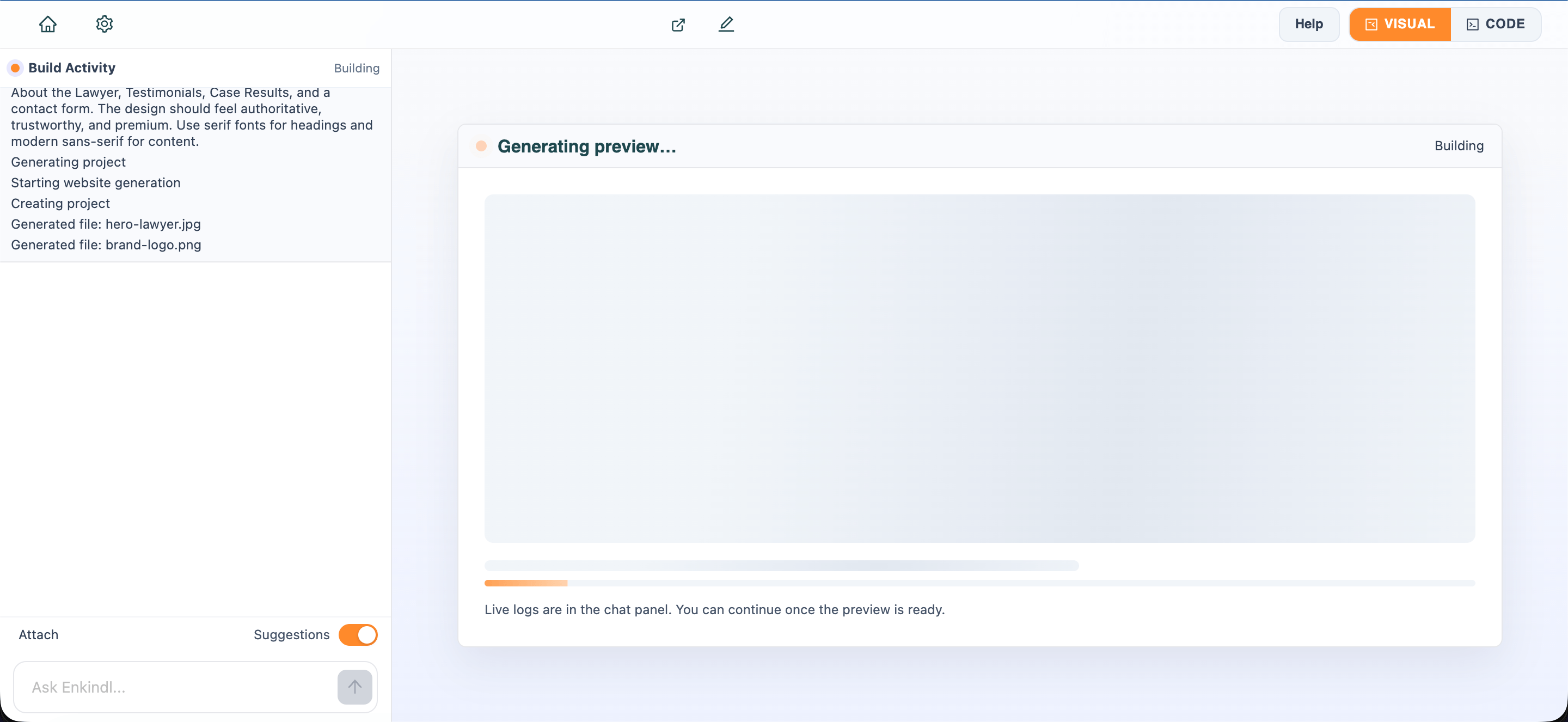
The AI Chat Assistant is built directly into the Editor page—it's not a separate tool but an integral part of your development workflow. Located in the left panel, it understands your entire project context including open files, recent edits, file structure, and even console errors. Think of it as a tireless pair programmer that's always aware of what you're working on.
This is where the magic happens after initial project generation. While the project generator creates your starting point, the AI Chat is your primary tool for everything that comes next: adding features, fixing bugs, refactoring code, explaining complex logic, and iterating on your design. Most users spend 80% of their time in Enkindl conversing with the AI Chat rather than manually editing code.
Where to Find It: Open any project in the Editor. The AI Chat is always visible in the left panel. You can resize this panel by dragging its edge, and your preferred width is saved for future sessions. The chat remains accessible whether you're in Code view or Visual Editor view.
Why Use AI Chat Instead of Manual Coding?
You might wonder: "Why not just edit the code directly?" Here's why AI Chat is often the better choice:
- Speed: Describing a change takes seconds. Writing the code manually takes minutes. "Add a dark mode toggle" is faster than implementing theme switching, state management, and CSS variables yourself.
- Accuracy: The AI knows your entire project structure and won't accidentally break imports or forget to update related files. It maintains consistency across your codebase.
- Learning: You can ask the AI to explain what it's doing, helping you learn as you build. "Why did you use useEffect here?" gets an instant, context-specific answer.
- Best Practices: The AI applies modern patterns, accessibility standards, and performance optimizations automatically. You get production-quality code without memorizing every best practice.
- Multi-File Changes: When a feature spans multiple files (component, styles, types, tests), the AI updates all of them in one go. No need to manually track dependencies.
That said, manual coding still has its place for fine-grained control, learning specific techniques, or when you know exactly what you want to write. The beauty of Enkindl is you can seamlessly switch between AI-assisted and manual development.
How It Integrates with the Editor
Unlike standalone AI tools (ChatGPT, Claude, etc.) where you copy-paste code back and forth, Enkindl's AI Chat works directly with your project files. This tight integration eliminates friction and speeds up development:
- Context Awareness: The AI knows which file you have open, what code is in it, and can see your entire project structure. When you ask "add a button here," it knows exactly where "here" is. It understands your component hierarchy, import paths, and how files relate to each other.
- Direct File Updates: When the AI generates or modifies code, changes are written directly to your files. You see updates in the Monaco editor immediately—no copy-paste required. The AI can modify multiple files in a single response if needed (e.g., updating a component and its corresponding CSS file).
- Live Preview Sync: After the AI makes changes, the live preview on the right updates automatically via hot module replacement. You see results instantly without manual refresh. This creates a rapid feedback loop: ask → AI changes code → preview updates → iterate.
- Error Integration: Console errors from your running preview are captured and displayed in the Errors Panel at the bottom of the chat. One click sends the complete error context (type, message, stack trace, source file) to the AI for automatic diagnosis and fixing. No more copying error messages manually.
- File Explorer Integration: The AI can reference any file in your project, even if it's not currently open. It automatically loads relevant files when needed to understand context.
- Version Control Awareness: The AI can see which files have uncommitted changes, helping it understand what you've been working on recently.
Basic Usage
Type a request in the input box at the bottom of the chat panel and press Enter (or click the send button). The AI reads your prompt, considers the current file and project structure, and responds with code, explanations, or direct file modifications.
Common Request Types
The AI Chat handles a wide variety of development tasks:
Adding Features
- "Add a contact form to this page with name, email, and message fields"
- "Create a modal dialog for newsletter signup"
- "Add a search bar to the header that filters the product list"
- "Implement a dark mode toggle with localStorage persistence"
- "Add pagination to the blog posts list"
Styling & Design
- "Change the header background to dark blue (#1e3a8a)"
- "Add hover effects to all buttons (scale up and change color)"
- "Make the hero section full-screen height"
- "Add responsive styles for mobile (stack columns vertically)"
- "Increase spacing between sections to 80px"
Code Explanation
- "Explain what this function does"
- "Why did you use useEffect here?"
- "What does this regex pattern match?"
- "Walk me through how this component works"
- "Explain the difference between these two approaches"
Refactoring
- "Refactor this component to use hooks instead of class syntax"
- "Extract this repeated code into a reusable utility function"
- "Split this large component into smaller, focused components"
- "Convert this JavaScript file to TypeScript with proper types"
- "Simplify this nested conditional logic"
Bug Fixing
- "Fix the error in this file" (when you see a red underline)"
- "The form doesn't submit when I press Enter"
- "Images aren't loading on the deployed site"
- "The mobile menu doesn't close after clicking a link"
- "Fix the TypeScript errors in this component"
Optimization
- "Optimize this component for better performance"
- "Add lazy loading to these images"
- "Memoize this expensive calculation"
- "Reduce the bundle size by code splitting"
- "Add loading states to prevent layout shift"
Smart Context Understanding
The AI Chat doesn't just read your message—it analyzes your entire project to understand what you're working on. When you ask a question, the system automatically:
- Identifies Relevant Files: Scans your project structure to find files related to your request. If you ask about "authentication," it looks for auth-related components, services, and utilities.
- Understands Dependencies: Recognizes how files connect through imports and exports, ensuring changes don't break existing functionality.
- Maintains Code Style: Matches your existing coding patterns, naming conventions, and formatting preferences when generating new code.
- Considers File Context: If you have a file open, the AI prioritizes that file when making changes, but can also modify related files when needed.
Threaded Conversations
By default, threaded mode is enabled (controlled by a toggle in the chat panel). This means the AI remembers previous messages in the conversation and can reference earlier context. For example:
You: Add a newsletter signup form.
AI: [Creates form with email input and submit button]

You: Make it a two-column layout.
AI: [Restructures the form into two columns]

You: Add validation for the email field.
AI: [Adds email regex validation with error messages]

You: Style it to match the rest of the page.
AI: [Applies consistent colors, fonts, and spacing]
Each message builds on the previous context, making iterative development natural. If you want each message to be independent (no memory of prior messages), toggle off the Threaded option.
Session Persistence
Your chat history is saved to session storage, so if you refresh the page or navigate away temporarily, your conversation remains intact. This is especially useful during longer development sessions where you might need to reference earlier AI responses.
Suggestions
After the AI responds, you may see suggestion chips—clickable prompts for follow-up actions like "Add form validation," "Make it responsive," or "Add hover effects." Click a chip to send that prompt instantly without typing. These contextual suggestions help you discover logical next steps.
Error Fixing (Errors Panel)
When your project throws a console error (JavaScript errors, failed imports, runtime exceptions), an Errors Panel appears at the bottom of the chat area. It shows:
- Error Type: The category of error (TypeError, SyntaxError, etc.)
- Message: The specific error message
- Stack Trace: Where the error occurred in your code
- Source URL: The file that triggered the error
Click the Fix button next to any error. The AI receives the complete error context and analyzes your code to propose a solution. This dramatically speeds up debugging—no more manually searching Stack Overflow or guessing at fixes.
Best Practices for AI Chat
Getting the most out of AI Chat requires good communication. Follow these practices for better results:
Be Specific and Detailed
Vague requests lead to generic results. Specific requests get exactly what you want:
| Vague | Specific | Why It's Better |
|---|---|---|
| "Add hover effect" | "Add a scale-up transform (1.05) and drop shadow on hover for all product cards" | Specifies exact effect, scale amount, and target elements |
| "Make it responsive" | "Stack the three-column layout into a single column on screens under 768px" | Defines breakpoint and desired behavior |
| "Fix the form" | "Add validation to the email field that shows an error message if the format is invalid" | Identifies specific field and desired validation behavior |
| "Change colors" | "Change the primary button color from blue to green (#10b981) and update all instances" | Specifies exact color and scope of change |
Provide Context
- Reference Files: "In the Header.tsx file, add a search icon" is clearer than "add a search icon."
- Describe Location: "In the hero section, below the headline" tells the AI exactly where to place something.
- Reference Existing Elements: "Make it match the existing button style" or "use the same colors as the navbar."
- Mention Related Files: "Update both the component and its CSS file" ensures comprehensive changes.
Iterate in Small Steps
Don't ask for five features at once. Request one, review the result, then move to the next. This approach:
- Gives you more control over the final result
- Makes it easier to spot and fix issues early
- Helps you learn what works and what doesn't
- Reduces the chance of the AI misunderstanding complex requests
Example progression:
- "Add a contact form" → Review
- "Add validation to the email field" → Review
- "Style the form to match the page theme" → Review
- "Add a success message after submission" → Review
Ask for Explanations
Use the AI as a learning tool, not just a code generator:
- "Explain why you used useEffect here" — Understand React patterns
- "What does this regex do?" — Learn regular expressions
- "Why did you choose this approach over X?" — Learn best practices
- "Walk me through how this component works" — Understand architecture
- "What are the trade-offs of this solution?" — Learn decision-making
Use It for Debugging
The AI excels at finding and fixing bugs:
- Paste Error Messages: Copy the full error from the console and paste it in chat. The AI analyzes the stack trace and proposes fixes.
- Describe Unexpected Behavior: "The modal doesn't close when clicking outside" or "The form submits twice" helps the AI understand the issue.
- Ask for Code Review: "Are there any issues with this component?" prompts the AI to check for bugs, performance problems, and best practice violations.
- Request Testing: "What edge cases should I test for this function?" helps you think through potential issues.
Leverage Conversation History
With threaded mode enabled (default), the AI remembers your conversation:
- Use pronouns: "Make it larger" (AI knows what "it" refers to from context)
- Build on previous requests: "Now add validation" (AI knows you're talking about the form you just created)
- Reference earlier changes: "Undo that last change" or "Go back to the previous version"
- Compare approaches: "Which is better, the first approach or this one?"
Know When to Be Direct
Sometimes you need to be very direct with the AI:
- "Delete the sidebar completely" — When you want something removed
- "Start over with a simpler approach" — When the solution is too complex
- "That's not what I wanted. I need..." — When the AI misunderstood
- "Keep the functionality but change the UI" — When you want to preserve logic
Real-World Usage Examples
Here are complete conversation flows showing how developers use AI Chat in practice:
Example 1: Building a Feature from Scratch
You: Create a user profile page with avatar, name, email, and bio fields
AI: [Creates ProfilePage.tsx with form fields, labels, and basic styling]
     "I've created a profile page component with all requested fields.
     The avatar is displayed as a circular image placeholder."

You: Add validation to ensure email format is correct
AI: [Adds email regex validation with error messages below the field]
     "Added email validation. Error message appears in red when format is invalid."

You: Make the avatar clickable to upload a new image
AI: [Adds file input, onChange handler, and image preview logic]
     "Avatar is now clickable. Users can select an image file and see a preview immediately."

You: Style it to match the dashboard theme
AI: [Applies consistent colors, fonts, and spacing from existing components]
     "Styled to match your dashboard: same card style, button colors, and spacing."

You: Add a save button that shows a success message
AI: [Adds button with loading state and toast notification]
     "Added save button with loading spinner. Success toast appears after saving."
Example 2: Refactoring Existing Code
You: This HomePage component is 500 lines long. Can you split it into smaller components?
AI: [Analyzes component structure and creates Hero, Features, Testimonials, CTA components]
     "Split into 4 focused components. Each handles one section. Imports updated in HomePage."

You: Extract the API calls into a separate service file
AI: [Creates services/api.ts with all fetch functions, updates imports]
     "Created api.ts service with fetchUsers, fetchPosts, and fetchComments functions.
     Updated all components to import from the service."

You: Add error handling to all API calls
AI: [Wraps fetch calls in try-catch, adds error state management]
     "Added error handling with try-catch blocks. Components now display error messages
     when API calls fail."
Example 3: Fixing Bugs
You: The form submits even when fields are empty
AI: [Adds validation checks before form submission]
     "Added validation: form only submits when all required fields are filled.
     Empty fields show error messages."

You: Users can submit the form multiple times by clicking rapidly
AI: [Adds loading state and disables button during submission]
     "Button now disables during submission and shows a loading spinner.
     Prevents duplicate submissions."

You: The success message doesn't disappear
AI: [Adds setTimeout to clear message after 3 seconds]
     "Success message now auto-dismisses after 3 seconds."
Example 4: Responsive Design Fixes
You: The navigation menu doesn't work on mobile
AI: [Adds hamburger menu with mobile breakpoint]
     "Added hamburger menu for screens under 768px. Menu slides in from the side."

You: The hero text is too small on mobile
AI: [Adds responsive font sizes using clamp()]
     "Hero text now scales smoothly from mobile to desktop using fluid typography."

You: Images overflow on small screens
AI: [Adds max-width: 100% and object-fit: cover]
     "Images now scale properly and never overflow their containers."
Example 5: Adding Complex Functionality
You: Add a shopping cart that persists across page refreshes
AI: [Creates cart context, localStorage hooks, and cart UI]
     "Created shopping cart with add/remove items, quantity adjustment, and localStorage
     persistence. Cart state survives page refreshes."

You: Add a checkout form with Stripe integration
AI: [Creates checkout form, adds Stripe Elements, handles payment]
     "Added checkout form with Stripe payment processing. Includes card input,
     validation, and success/error handling."

You: Show a loading spinner during payment processing
AI: [Adds loading state and disables form during submission]
     "Payment button shows spinner and disables during processing. Form re-enables
     on success or error."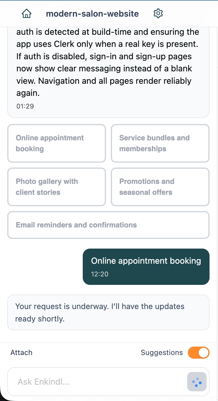
Code Editor
The built-in code editor is powered by Monaco Editor—the same engine behind VS Code. It gives you a professional development environment with syntax highlighting, IntelliSense, multi-cursor editing, and keyboard shortcuts you already know. What makes Enkindl's editor unique is the seamless integration of an AI Chat Assistant directly within the editor interface, allowing you to request code changes, ask questions, and fix errors without leaving your workflow.
Interface Layout
When you open a project in Code view, you'll see a unified workspace with these main areas:
- Left Panel — AI Chat & Build Activity: This is where the magic happens. The AI Chat Assistant lives here, always available to help you write code, refactor components, fix bugs, or explain complex logic. During project generation, this panel also displays real-time Build Activity logs showing progress, file creation, and status updates.
- Center — Monaco Code Editor: The main editing area where you write and modify code. It supports all major web languages: JavaScript, TypeScript, HTML, CSS, JSON, Markdown, and more. Features include syntax highlighting, auto-completion, bracket matching, and intelligent suggestions.
- Right Panel (overlay) — File Explorer: Click the folder icon to open it. Browse your project structure, search for files by name, view changed files, and access Git diffs. The tree view shows your complete project hierarchy.
- Live Preview: A real-time preview of your application renders alongside the editor, updating as you make changes. This immediate feedback loop helps you iterate quickly.
Key Insight: The AI Chat (covered in detail in the previous section) is deeply integrated into your editing experience. You can ask the AI to modify the file you're currently viewing, and it will make changes directly to your code. This tight integration means you never have to copy-paste between tools.
Working with Files
Opening Files
Click the folder icon to open the File Explorer. Navigate the tree and click any file to open it in the editor. You can also press Cmd+P (Mac) or Ctrl+P (Windows/Linux) to quick-search by filename.
Creating Files
In the File Explorer, click the New File button (+ icon). Enter the full path including folder if needed—for example, components/Card.jsx. The file opens automatically with a language-appropriate template.
Creating Folders
Click the New Folder button and enter the path (e.g., utils/helpers). The folder appears in the tree immediately.
Keyboard Shortcuts
Mastering shortcuts dramatically speeds up your workflow. Here are the essentials:
| Action | Mac | Windows/Linux |
|---|---|---|
| Save file | Cmd+S | Ctrl+S |
| Undo | Cmd+Z | Ctrl+Z |
| Redo | Cmd+Shift+Z | Ctrl+Y |
| Find in file | Cmd+F | Ctrl+F |
| Find and replace | Cmd+H | Ctrl+H |
| Toggle comment | Cmd+/ | Ctrl+/ |
| Move line up/down | Option+↑/↓ | Alt+↑/↓ |
| Duplicate line | Shift+Option+↑/↓ | Shift+Alt+↑/↓ |
| Add cursor | Option+Click | Alt+Click |
| Select next occurrence | Cmd+D | Ctrl+D |
Saving & Unsaved Changes
When you edit a file, an unsaved indicator (dot) appears next to the filename. Press Cmd+S or Ctrl+S to save. If you try to navigate away with unsaved changes, a modal asks whether to save, discard, or cancel. Auto-save is not enabled—always save manually to avoid losing work.
Code Search
Use Cmd+F / Ctrl+F to search within the current file. For project-wide search, open the File Explorer and switch to the search mode. Enter a query to see matching files and line-by-line results. Click a result to jump directly to that location.
IntelliSense & Auto-Completion
As you type, the editor provides intelligent suggestions based on your code context:
- Variable & Function Names: Suggests available variables, functions, and imports as you type.
- Method Completion: Shows available methods when you type a dot after an object.
- Parameter Hints: Displays function signatures and parameter types as you call functions.
- Import Suggestions: Automatically suggests imports for components and utilities you reference.
- Snippet Expansion: Type common patterns like "for", "if", or "func" and press Tab to expand into full code blocks.
Multi-Cursor Editing
Edit multiple locations simultaneously for faster refactoring:
- Add Cursor: Hold Alt (Windows/Linux) or Option (Mac) and click to add cursors at multiple positions.
- Select Next Occurrence: Press Cmd+D / Ctrl+D to select the next occurrence of the current selection. Repeat to select more.
- Column Selection: Hold Shift+Alt and drag to select a rectangular block of text.
Multi-cursor editing is perfect for renaming variables, updating multiple similar lines, or adding the same code to multiple locations.
Visual Editor
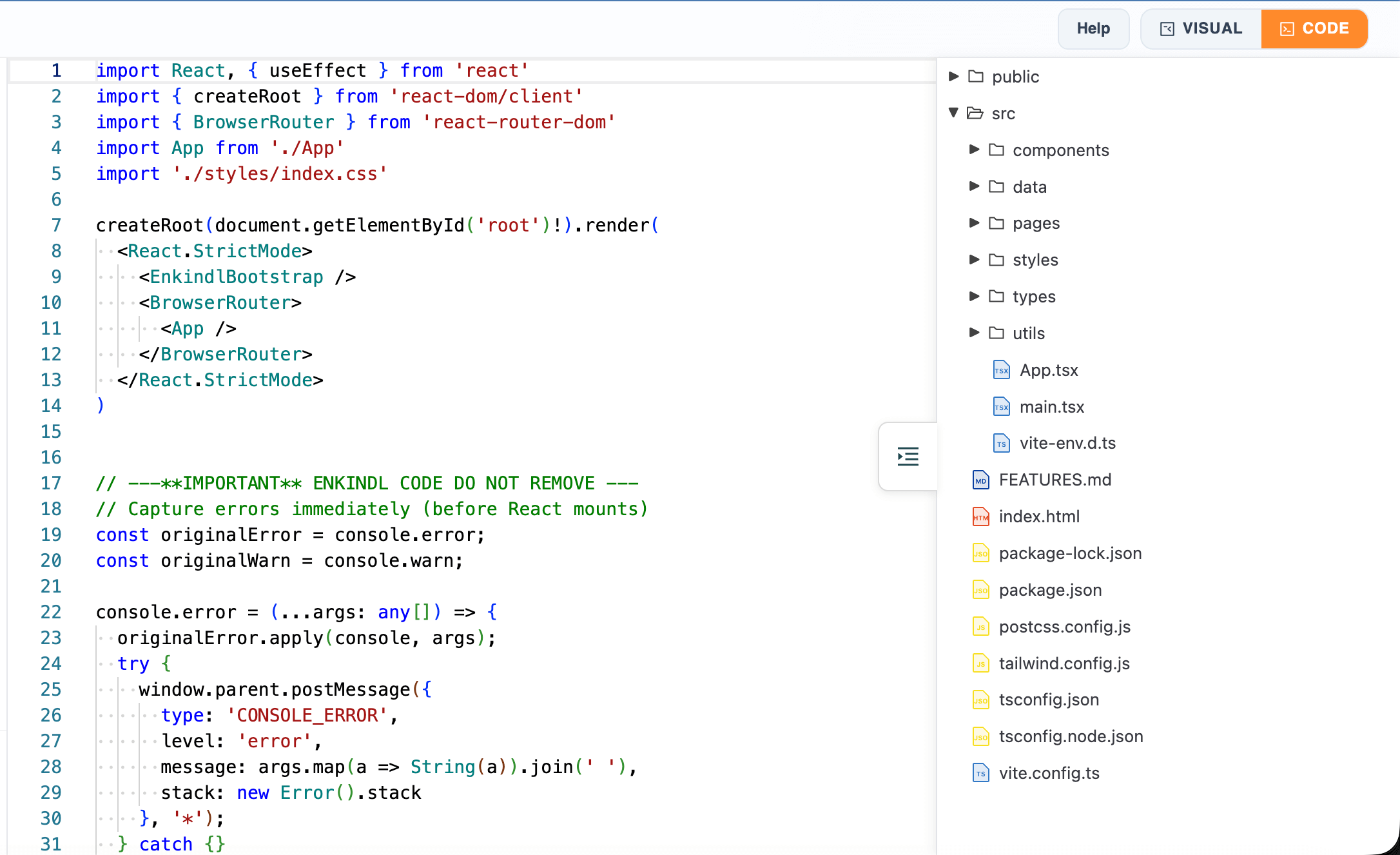
The Visual Editor provides a drag-and-drop interface for designing web pages without writing code. It's perfect for building landing pages, marketing sites, and layouts where visual precision matters. Think of it as a professional design tool that outputs clean, production-ready HTML and CSS.
While the AI Chat excels at generating entire features and the Code Editor gives you precise control, the Visual Editor is ideal for fine-tuning layouts, adjusting spacing, experimenting with colors, and making design decisions visually. Many users follow this workflow: AI generates the structure → Visual Editor refines the design → Code Editor adds custom logic.
When to Use Visual Editor vs. Code Editor
Choose the right tool for the task:
| Use Visual Editor For | Use Code Editor For |
|---|---|
| Adjusting layouts and spacing | Writing JavaScript logic |
| Changing colors and fonts | Adding event handlers |
| Repositioning elements | Managing state and props |
| Adding/removing sections | Importing libraries |
| Responsive design tweaks | API integration |
| Visual experimentation | Complex conditional logic |
Interface Overview
The Visual Editor interface is organized into four main areas, each serving a specific purpose:
- Top Toolbar: Contains essential controls including Save (persists changes to your project), device preview buttons (desktop/tablet/mobile/mobile landscape), undo/redo buttons, and view options. The toolbar stays visible as you scroll, ensuring quick access to key functions.
- Left Panel (Blocks): Your component library. Drag pre-built blocks like Text, Image, Video, Button, Columns, Forms, Maps, and more onto the canvas. Blocks are organized by category (Basic, Layout, Forms, Media) for easy discovery. Each block is a starting point you can customize extensively.
- Center (Canvas): Your design workspace where you build and arrange your page. Click any element to select it (blue border indicates selection). Drag elements to reposition them. Hover over elements to see their boundaries. The canvas scales to match the selected device preview, helping you design responsively.
- Right Panel (Style Manager): Your CSS control center. When you select an element, this panel shows all available style properties organized into categories: General (display, position), Dimension (width, height, padding, margin), Typography (font, size, weight, color), Decorations (background, border, shadow), and Extra (transform, transition, opacity). Changes apply instantly.
Getting Started with Visual Editor
Follow these steps to start designing:
- Switch to Visual Mode: In the editor, click the "Visual" tab at the top to switch from Code view to Visual Editor. Your project loads in the canvas.
- Select Device View: Choose desktop, tablet, or mobile from the toolbar to design for your target screen size. Start with desktop, then adjust for smaller screens.
- Click to Select: Click any element on the canvas to select it. The Style Manager on the right updates to show that element's properties.
- Drag to Add: Drag blocks from the left panel onto the canvas. A blue guide line shows where the block will land when you release.
- Style Your Elements: With an element selected, use the Style Manager to adjust colors, fonts, spacing, and more. Changes appear instantly.
- Save Frequently: Click the Save button in the toolbar or use Cmd+S / Ctrl+S. Changes sync back to your code files automatically.
Adding & Arranging Components
Building your page is as simple as drag and drop:
Adding Components
- Find the Block: Browse the Blocks panel on the left. Blocks are organized by category: Basic (text, image, button), Layout (columns, rows, containers), Forms (input, textarea, checkbox), and Media (video, map, iframe).
- Drag to Canvas: Click and hold a block, then drag it onto the canvas. A blue guide line appears showing where the block will be placed. This helps you position elements precisely.
- Release to Drop: Release your mouse to drop the block. It appears on the canvas, ready to customize.
- Adjust Position: If the placement isn't perfect, click and drag the element to reposition it. You can move elements up, down, or into different containers.
Arranging and Organizing
- Drag to Reorder: Click and drag any element to move it. Drag up or down to change order within a container. Drag left or right to move between columns.
- Use Layers Panel: Click the layers icon in the toolbar to see your page structure as a tree. Drag elements in the layers panel to reorder them without visual guesswork.
- Nesting Elements: Drag an element onto a container (like a column or section) to nest it. This creates parent-child relationships for better organization.
- Duplicate Elements: Right-click an element and select "Duplicate" to create a copy. Useful for creating consistent layouts (e.g., multiple product cards).
- Delete Elements: Select an element and press Delete key, or right-click and choose "Delete."
Common Components Explained
Here's what each major component does and how to use it:
Text Block
- Purpose: Add headings, paragraphs, and formatted text
- How to Edit: Double-click to enter edit mode. Type your content. Use the floating toolbar for bold, italic, underline, links, and text alignment.
- Styling: Select the text block (single click) and use Style Manager to change font family, size, weight, color, line height, and letter spacing.
- Pro Tip: Use semantic HTML tags (h1, h2, p) for better SEO and accessibility.
Image Block
- Purpose: Display photos, graphics, logos, and illustrations
- How to Add: Drag the image block to canvas. It automatically opens the Asset Manager. Upload a new image or select from existing assets.
- Styling: Adjust width, height, border radius (for rounded corners), object-fit (cover, contain), and add filters (grayscale, blur, brightness).
- Pro Tip: Always add alt text (in the Traits panel) for accessibility and SEO.
Button Block
- Purpose: Create clickable call-to-action buttons
- How to Edit: Double-click to change the button text. In Traits panel, set the link URL and choose whether it opens in a new tab.
- Styling: Customize background color, text color, padding, border radius, hover effects, and transitions. Create primary, secondary, and outline button styles.
- Pro Tip: Use consistent button styles across your site for better UX.
Columns Block
- Purpose: Create multi-column layouts (2-column, 3-column, 4-column)
- How to Use: Drag a columns block to canvas. It comes with empty columns. Drag other blocks (text, images, buttons) into each column to build your layout.
- Styling: Adjust column widths, gaps between columns, and responsive behavior (stack on mobile).
- Pro Tip: Columns automatically stack vertically on mobile for better readability.
Form Elements
- Purpose: Collect user input (contact forms, signup forms, surveys)
- Available Elements: Input (text, email, password), Textarea (multi-line text), Checkbox, Radio buttons, Select dropdown, Submit button
- How to Configure: Use the Traits panel to set field names, placeholders, required status, and validation rules.
- Pro Tip: Group related fields in a form container for better organization.
Video Block
- Purpose: Embed videos from YouTube, Vimeo, or direct video files
- How to Add: Drag video block to canvas. In Traits panel, paste the video URL (YouTube, Vimeo, or direct .mp4 link).
- Styling: Set width, height, border radius, and add a poster image (thumbnail shown before play).
- Pro Tip: Use aspect ratio 16:9 for standard videos, 9:16 for vertical mobile videos.
Map Block
- Purpose: Embed Google Maps or other map services
- How to Add: Drag map block to canvas. In Traits panel, enter the address or coordinates.
- Styling: Adjust dimensions and add border styling.
- Pro Tip: Use maps for contact pages, store locators, and event locations.
Styling with the Style Manager
The Style Manager is your CSS control panel. Select any element on the canvas, and the Style Manager shows all available properties organized into logical categories. Every change you make applies instantly to the canvas, giving you immediate visual feedback.
Style Categories Explained
General Properties
- Display: Control how the element renders (block, inline, flex, grid, none). Use flex for flexible layouts, grid for complex grids, none to hide elements.
- Position: Set positioning mode (static, relative, absolute, fixed, sticky). Absolute positions relative to parent, fixed positions relative to viewport.
- Overflow: Control what happens when content exceeds element size (visible, hidden, scroll, auto).
- Float: Float elements left or right (mostly replaced by flexbox, but still useful for text wrapping).
Dimension Properties
- Width & Height: Set element size in pixels, percentages, or viewport units (vw, vh). Use percentages for responsive layouts.
- Min/Max Width & Height: Set boundaries for responsive sizing. Example: max-width: 1200px prevents content from stretching too wide on large screens.
- Padding: Space inside the element, between content and border. Adjust all sides together or individually (top, right, bottom, left).
- Margin: Space outside the element, between it and other elements. Use margin: auto for horizontal centering.
Typography Properties
- Font Family: Choose from web-safe fonts or custom fonts. Common choices: Arial, Helvetica, Georgia, Times New Roman, or Google Fonts.
- Font Size: Set text size in pixels, ems, or rems. Use rem for scalable, accessible typography.
- Font Weight: Control text thickness (100-900). 400 is normal, 700 is bold.
- Line Height: Space between lines of text. 1.5 is a good default for readability.
- Letter Spacing: Space between characters. Increase for headlines, decrease for body text.
- Text Align: Align text left, center, right, or justify.
- Text Transform: Change case (uppercase, lowercase, capitalize).
- Color: Set text color using color picker or hex codes.
Decoration Properties
- Background Color: Set solid background color using color picker or hex/rgb values.
- Background Image: Add background image from Asset Manager. Control size (cover, contain), position, and repeat.
- Background Gradient: Create linear or radial gradients with multiple color stops.
- Border: Add borders with customizable width, style (solid, dashed, dotted), and color. Set all sides together or individually.
- Border Radius: Round corners. Use pixels for subtle rounding, percentages for circles (50%).
- Box Shadow: Add depth with shadows. Control horizontal offset, vertical offset, blur radius, spread, and color. Stack multiple shadows for complex effects.
Extra Properties
- Opacity: Control transparency (0 = invisible, 1 = fully opaque). Use for overlays and fade effects.
- Transform: Apply transformations like rotate, scale, translate, and skew. Great for hover effects.
- Transition: Animate property changes. Set duration, timing function (ease, linear), and delay. Example: transition all 0.3s ease for smooth hover effects.
- Cursor: Change cursor appearance on hover (pointer for clickable elements, text for text selection).
- Z-Index: Control stacking order. Higher values appear on top. Use for modals, dropdowns, and overlays.
Using the Style Manager Effectively
- Instant Preview: Every change applies immediately. Experiment freely—you can always undo (Cmd+Z / Ctrl+Z).
- Responsive Styling: Switch device views in the toolbar, then adjust styles. Changes made in mobile view only affect mobile screens, preserving your desktop design.
- Copy Styles: Right-click an element and select "Copy" to copy its styles, then "Paste" on another element to apply the same styling.
- Reset Styles: Click the reset icon next to any property to return it to its default value.
- Custom CSS: For advanced users, click the "</>" icon to write custom CSS directly. This gives you full control beyond the visual controls.
Responsive Design
Building responsive websites is crucial—over 60% of web traffic comes from mobile devices. The Visual Editor makes responsive design intuitive with device preview modes and breakpoint-specific styling.
Device Preview Modes
Click the device icons in the toolbar to switch between different screen sizes:
- Desktop: 1920px wide — Your default design view for large screens
- Tablet: 768px wide — iPad and similar tablets
- Mobile Portrait: 375px wide — iPhone and Android phones in vertical orientation
- Mobile Landscape: 667px wide — Phones in horizontal orientation
The canvas resizes to match the selected device, showing exactly how your page looks on that screen size. This helps you spot layout issues before they reach real users.
Breakpoint-Specific Styling
Here's the powerful part: any style changes you make while viewing a specific device size are scoped to that breakpoint. This means:
- Changes made in Desktop view apply to all screen sizes (base styles)
- Changes made in Tablet view only affect tablets and smaller screens
- Changes made in Mobile view only affect mobile devices
This cascading approach lets you fine-tune layouts for each screen size without affecting others. For example:
- Design your three-column layout in Desktop view
- Switch to Tablet view and adjust to two columns
- Switch to Mobile view and stack into a single column
Common Responsive Patterns
Stacking Columns
Desktop: Three columns side by side
Tablet: Two columns, third wraps below
Mobile: All columns stack vertically
How to do it: In Mobile view, select the columns container and change flex-direction from "row" to "column" in the Style Manager.
Hiding Elements
Some elements work great on desktop but clutter mobile screens (sidebars, large images, decorative elements).
How to do it: In Mobile view, select the element and set Display to "none" in the Style Manager. It disappears on mobile but remains visible on desktop.
Adjusting Font Sizes
Large headlines that look great on desktop can be overwhelming on mobile.
How to do it: In Mobile view, select the heading and reduce the font size. Desktop size remains unchanged.
Changing Padding and Spacing
Desktop designs often have generous spacing. Mobile screens need tighter spacing to fit more content.
How to do it: In Mobile view, reduce padding and margin values for sections and containers.
Testing Responsive Design
- Preview All Sizes: Click through all device views to ensure your design works everywhere.
- Check Text Readability: Ensure text is large enough to read on mobile (minimum 16px for body text).
- Test Touch Targets: Buttons and links should be at least 44x44px on mobile for easy tapping.
- Verify Image Scaling: Images should scale down gracefully without pixelation or overflow.
- Check Navigation: Ensure mobile navigation (hamburger menu) works smoothly.
Tip: Start designing for desktop, then progressively adjust for smaller screens. This "desktop-first" approach often requires fewer overrides. However, if your audience is primarily mobile, consider starting with mobile design and enhancing for desktop ("mobile-first").
Advanced Techniques
Creating Reusable Components
If you use the same design pattern multiple times (e.g., product cards, team member profiles), create one perfect version, then duplicate it:
- Design your component (e.g., a product card with image, title, price, button)
- Right-click the component and select "Duplicate"
- Modify the duplicated content (change image, text, etc.)
- Repeat for as many instances as needed
This ensures consistency across your site and speeds up development.
Using Custom Classes
For advanced styling, you can add custom CSS classes to elements:
- Select an element on the canvas
- In the Traits panel, find the "Classes" field
- Enter a class name (e.g., "hero-button", "product-card")
- Switch to Code Editor and add CSS for that class
This gives you the flexibility of custom CSS while maintaining visual editing capabilities.
Working with Hover States
Create interactive hover effects for buttons and links:
- Select the element (e.g., a button)
- In the Style Manager, find the state selector (usually a dropdown showing "Normal")
- Change it to "Hover"
- Adjust styles (e.g., change background color, add transform: scale(1.05))
- Add a transition in Normal state for smooth animation
Creating Animations
Add subtle animations to make your site feel more dynamic:
- Fade In: Set initial opacity to 0, add transition, then change to 1
- Slide In: Use transform: translateX(-100px) initially, then translateX(0)
- Scale Up: Use transform: scale(0.8) initially, then scale(1)
- Rotate: Use transform: rotate(0deg) initially, then rotate(360deg)
Combine these with transitions for smooth, professional animations.
Saving & Publishing
The Visual Editor auto-saves every 5 seconds after a change, so you rarely lose work. You can also manually save via the Save button in the toolbar or by pressing Cmd+S / Ctrl+S.
When you save, changes are written back to your project files and reflected in the Code Editor. The synchronization is bidirectional—changes in Visual Editor update the code, and changes in Code Editor update the visual view. There's no separate "publish" step—your project is always the source of truth.
What Gets Saved
- HTML Structure: All elements, their hierarchy, and content
- CSS Styles: All styling applied through the Style Manager
- Responsive Breakpoints: Device-specific styles for tablet and mobile
- Custom Classes: Any classes you added to elements
- Asset References: Links to images, videos, and other assets
Switching Between Visual and Code
You can freely switch between Visual Editor and Code Editor:
- Changes made in Visual Editor appear in the code immediately
- Changes made in Code Editor update the visual view when you switch back
- Both views work with the same files—there's no export/import step
Many users follow this workflow: Visual Editor for layout and design → Code Editor for adding JavaScript logic → Visual Editor for final polish.
Visual Editor Limitations
While powerful, the Visual Editor has some limitations. Understanding these helps you choose the right tool:
- JavaScript Logic: You can't write JavaScript in Visual Editor. Use Code Editor for event handlers, state management, and API calls.
- Complex Components: React components with props and state are better managed in Code Editor.
- Dynamic Content: Content that changes based on data (loops, conditionals) requires code.
- Third-Party Libraries: Integrating libraries like charts, maps, or animations requires code.
For these scenarios, use the AI Chat or Code Editor. The Visual Editor excels at layout, styling, and static content—which covers 80% of web design tasks.
Asset Manager
The Asset Manager is your central hub for images, videos, fonts, and SVGs. Upload files from your computer, generate images with AI, and organize everything in one place.
Uploading Assets
Drag files onto the upload area or click to browse. Supported formats include PNG, JPEG, WebP, GIF, SVG, MP4, WebM, OGG, TTF, OTF, WOFF, and WOFF2. Images can be up to 25 MB; videos up to 100 MB.
AI Image Generation
Need a placeholder or custom graphic? Use the AI generator. Enter a description like "abstract gradient background in purple and blue" and select a size (512×512 or 1024×1024). Click Preview to see the result. If you like it, click Add to save it to your library.
Using Assets in Your Project
In the Visual Editor, selecting an image component opens the Asset Manager. Click an asset to apply it. In the Code Editor, reference assets by path:
import heroImg from '../assets/images/hero.png';

function Hero() {
  return <img loading="lazy" decoding="async" src={heroImg} alt="Hero" />;
}
Optimization Tips
- Compress before upload. Use tools like TinyPNG or Squoosh to reduce file size without losing quality.
- Choose the right format. Use WebP for photos (best compression), PNG for transparency, SVG for icons and logos.
- Size appropriately. Don't upload a 4000×3000 image if it'll display at 400×300. Resize first.
GitHub Integration
Connect your Enkindl projects to GitHub for version control, collaboration, and deployment. Push AI-generated projects to new repositories, sync changes, and manage your code with Git.
Connecting GitHub
Open Project Settings
In the editor toolbar, click the Settings icon (⚙️) to open the Settings modal.
Connect GitHub
In the GitHub Integration section, click Connect GitHub. You'll be redirected to GitHub to authorize the Enkindl app.
Authorize & Install
Review the permissions (read/write repo access) and click Install & Authorize. Choose whether to grant access to all repositories or only select ones.
Confirmation
You'll be redirected back to Enkindl with a success message. GitHub status now shows "Connected."
Pushing to a New Repository
In Project Settings → GitHub, enter a repository name (lowercase, hyphens for spaces), an optional description, and choose visibility (public or private). Click Push to GitHub. The system creates the repo, initializes Git, commits all files, and pushes. A success message includes the repo URL.
Syncing Changes
Pulling: If collaborators pushed changes or you edited on GitHub directly, click Pull from GitHub to fetch the latest code.
Pushing: After making edits in Enkindl, enter a commit message and click Push to GitHub. Your changes upload to the remote repository.
Commit Message Best Practices
- Use present tense: "Add feature" not "Added feature."
- Be concise but descriptive: "Fix mobile nav toggle" not "Fixed stuff."
- Reference issues if applicable: "Close #42."
Git Diff & Version Control
Version control tracks every change you make, letting you review history, compare versions, and revert mistakes. Enkindl integrates Git so you can see diffs, commit changes, and stay in sync with your remote repository.
Viewing Changed Files
Open the File Explorer and click the Diff tab. You'll see a list of modified, added, or deleted files since the last commit. Each file shows a status indicator:
- M — Modified
- A — Added
- D — Deleted
- R — Renamed
Reading Diffs
Click a changed file to open a side-by-side diff view. The left pane shows the original (before), the right pane shows your edits (after). Colors indicate changes:
- Green background: Added lines
- Red background: Deleted lines
- Yellow highlight: Modified content
Discarding Changes
If you want to revert a file to its last committed state, open it in diff view and click Discard. Confirm the action. The file reverts immediately. This cannot be undone.
Committing Changes
When you're ready to save your work to Git, click Commit All in the toolbar. Enter a descriptive commit message and click Commit. Your changes are committed and pushed to the linked GitHub repository.
Warning: Discarding changes is permanent. Always double-check before clicking Discard.
Advanced Features
Once you're comfortable with the basics, these advanced features will supercharge your productivity.
Collaborative Editing with GitHub
Work with team members by connecting your project to GitHub. Multiple developers can:
- Clone the repository and work on different features simultaneously
- Create branches for new features or bug fixes
- Submit pull requests for code review before merging
- Track issues and project progress using GitHub Issues
- Use GitHub Actions for automated testing and deployment
When collaborators push changes, simply click "Pull from GitHub" in Enkindl to sync their work into your editor.
Custom Deployment Workflows
Beyond the built-in preview, you can deploy your projects to production hosting:
- Vercel: Connect your GitHub repository to Vercel for automatic deployments on every push.
- Netlify: Link your repo to Netlify for continuous deployment with custom domains.
- GitHub Pages: Enable GitHub Pages in your repository settings to host static sites for free.
- Custom Servers: Use the generated code on any Node.js hosting platform (AWS, DigitalOcean, Heroku).
Environment Variables & Configuration
Manage sensitive data and environment-specific settings:
- Create a .env file in your project root for API keys and secrets
- Reference variables in your code using process.env.VARIABLE_NAME
- Never commit .env files to Git (they're automatically excluded via .gitignore)
- Set production environment variables in your hosting platform's dashboard
// .env file
VITE_API_KEY=your_api_key_here
VITE_API_URL=https://api.example.com

// In your code
const apiKey = import.meta.env.VITE_API_KEY;
Performance Optimization
Make your applications faster with these techniques:
- Code Splitting: Use dynamic imports to load components only when needed, reducing initial bundle size.
- Image Optimization: Compress images before upload and use modern formats like WebP.
- Lazy Loading: Defer loading of off-screen images and components until they're needed.
- Caching: Implement browser caching for static assets to speed up repeat visits.
Accessibility Best Practices
Build inclusive applications that work for everyone:
- Add alt text to all images for screen readers
- Use semantic HTML elements (header, nav, main, footer) for better structure
- Ensure sufficient color contrast for text readability
- Make interactive elements keyboard-accessible (Tab navigation)
- Add ARIA labels to custom components for assistive technologies
Ask the AI Chat: "Make this component accessible" to automatically apply accessibility improvements.
Testing Your Application
While Enkindl focuses on rapid development, you can add testing to your projects:
- Manual Testing: Use the live preview to test functionality across different screen sizes.
- Browser Testing: Open your deployed URL in different browsers (Chrome, Firefox, Safari, Edge).
- Mobile Testing: Use browser DevTools device emulation or test on real devices.
- Automated Testing: Add testing libraries (Jest, React Testing Library) via package.json and write tests in your code editor.
Troubleshooting
Running into issues? Here are solutions to the most common problems.
Build Fails
- Check the Build Activity logs for error messages.
- Verify your prompt isn't too complex—try simplifying.
- Confirm you have sufficient credits in Usage & Billing.
- If network issues, wait a moment and click Retry.
Blank Preview
- Ensure the dev server started successfully (look for "Completed with URL" in logs).
- Refresh the preview pane.
- Check for JavaScript errors in your code.
Styles Not Applying
- Confirm the CSS file is imported in your component or HTML.
- Check class names for typos.
- In the Visual Editor, make sure the correct device view is selected.
Changes Not Saving
- Verify your internet connection.
- Press Cmd+S / Ctrl+S to manually save.
- Look for error toasts or console messages.
Git Push/Pull Fails
- Ensure GitHub is connected in Project Settings.
- Check that the repository exists and you have write access.
- Resolve any merge conflicts locally before pushing.
AI Not Responding
- Check your internet connection.
- Verify you have available credits in Usage & Billing.
- Refresh the page and try again.
- Clear your browser cache and cookies if the issue persists.
- Try a different browser to rule out browser-specific issues.
Slow Performance
- Close unused browser tabs to free up memory.
- Disable browser extensions that might interfere with the editor.
- Check if your project has very large files (>1MB) that slow down the editor.
- Clear the browser cache to remove old cached data.
- Ensure your computer meets the minimum system requirements.
Preview Not Updating
- Save your file first (Cmd+S / Ctrl+S).
- Click the refresh button in the preview pane.
- Check if there are JavaScript errors preventing the app from running.
- Try closing and reopening the project.
Can't Find a File
- Use the quick search (Cmd+P / Ctrl+P) to search by filename.
- Check if the file is in a nested folder you haven't expanded.
- Verify the file wasn't accidentally deleted (check Git Diff tab).
- Ask the AI Chat: "Where is the [filename] file?"
GitHub Connection Issues
- Verify you completed the OAuth authorization flow.
- Check if your GitHub token expired (reconnect if needed).
- Ensure you have the necessary permissions for the repository.
- Try disconnecting and reconnecting GitHub in Project Settings.
Getting Help
If you can't resolve an issue using this guide:
- Contact Support: Use the Contact page to reach our support team. Include details about what you were doing when the issue occurred.
- Community Forums: Check if others have experienced similar issues and found solutions.
- Documentation: Search this documentation for specific topics or features.
- AI Chat: Ask the AI Chat for help with code-related issues. It can often diagnose and fix problems automatically.
Still stuck? Reach out via the Contact page or check the community forums for help. When reporting issues, include: what you were trying to do, what happened instead, any error messages, and your browser version.